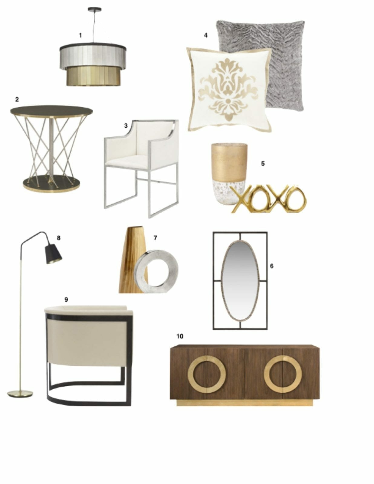
Aubergine and Navy Home Design Inspiration Board
If I could just unsee burgundy and hunter green …..
Everyone I knew in the early 1990’s painted one room burgundy and another room hunter green. Some tried their hands at contrast: burgundy above the chair rail and hunter green below it in a single room. The worst offenders mixed wall coverings. At least with paint you can erase your mistake fairly simply and inexpensively but those wallpaper hoodlums lived with their bad choices through the passing of three more color trends, pretending all the way that they were ahead of the next burgundy/hunter green fad.
I say all that because I’ve created this Aubergine and Navy Home Design Inspiration Board and I don’t want anyone confusing Aubergine with burgundy. Aubergine has a more blue than 1990’s burgundy. It is a more sophisticated hue and it’s sophistication is heightened when paired with a deep navy blue. And it’s just damn sexy!
What I like about this color palette is that it looks equally gorgeous with either gold/tan neutrals or palette or silver/gray neutrals. I wouldn’t be averse to adding some very tiny hints of emerald green to add some depth, but listen closely, we aren’t talking carnival here. Tiny hints of Emerald Green can be in the form of a pillow or accessory, but elegance jumps headfirst out the window if you overdue the green in this palette.
For pricing and availability, contact Jamie Kern with Design Theory Interiors of California, Inc. at jkern@designtheoryinteriors.com
Aubergine and Navy Home Decor Inspiration board


